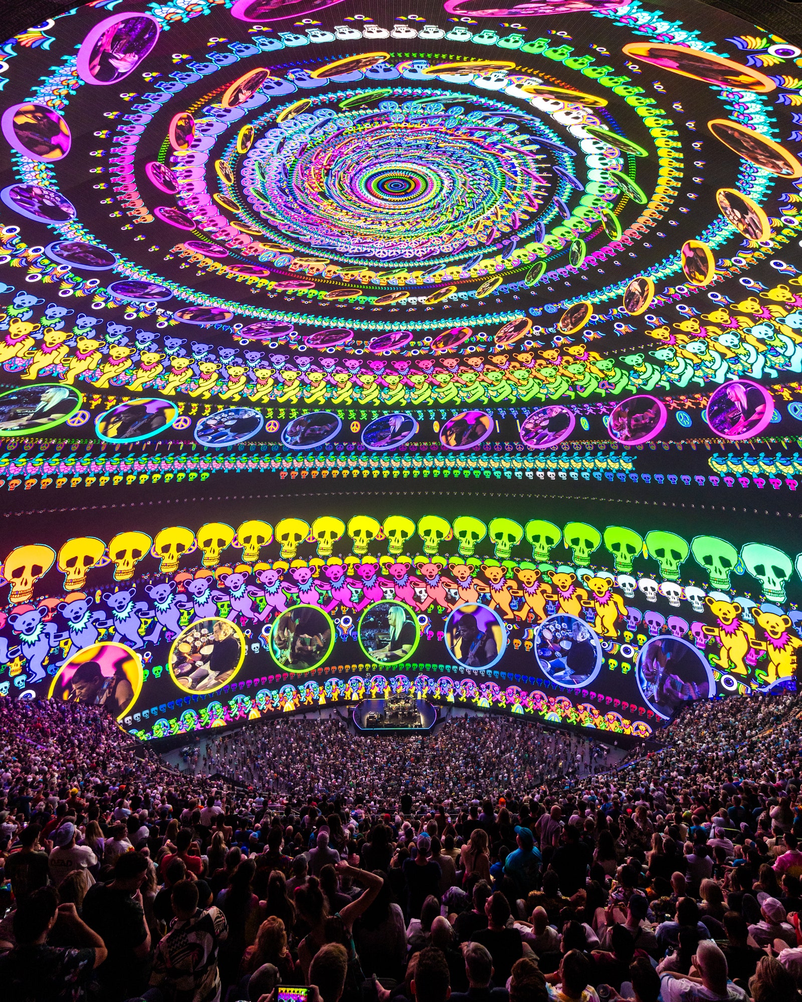
Throughout the show, the digital canvas of Sphere bridged the past and present, continuing the band’s experimentation with digital art in multimedia environments since their inception. “The band is explorative so they’re not afraid to try new stuff,” Pattinson recalls. “But we simultaneously brought back recognizable brand moments from the ’60s and ’70s for our fans. Tie-dyes and spirals were especially effective at engaging the audience.” Art Nouveau–psychedelic–inspired posters in the ’60s, which were created by American artist Stanley Mouse, an early adopter of MacPaint, swirled and engulfed us in the crowd. The visual wizardry, coupled with improvisational instrumentals, also harkened back to their Acid Tests days, where the Dead interpolated songs with hiatuses of silence, filling the void with a cacophony of lights and incoherence. We even revisited the Dead’s iconic rooftop show at Cornell University, bringing the two-dimensional, black-and-white photos I had seen in my university’s 1977 yearbooks to life. “I loved watching people just trying to figure out what they’re looking at. There was an intellectual thrill to it,” Williams reflects.
One of my favorite songs of the show was “Terrapin Station,” which meditates on the unfolding of untapped potential and imagination, during which the screen swept across a fluorescent mountain sunset, quite literally bringing the lyricism to life in new dimensions. A row of dancing bears emerged and began marching in a spiral around us, duplicating into hundreds and thousands of bears, skulls, peace signs, flying eyes, and windows with live feed footage of the band members spiraled into a visual cacophony that consumed us. “It’s like drugs for people who don’t do drugs,” Williams laughs. “In fact, we had semi-serious conversations about suggesting people to attend sober. Because we didn’t know how it would be for people to be tripping in that space…. It would almost be too much.”
The dialogue between historic references and contemporary reinterpretations was especially compelling due to the live feed at every show. “It was a little worrying that something could go wrong if there’s a problem with the video. We would get the setlist the day before and then allocate the bits of video to the songs and tempo,” Pattinson shares. Abigail Rosen Holmes, Phish’s show director and co–creative director for Sphere, adds that her team developed a loose framework of themes for each night and manipulated the visuals live in response to the music and audience. “Maintaining the primacy of the live music performance was one of our core goals. One aspect of supporting the band’s wide ranging musicianship was to create content all of which could be manipulated and affected in real time, allowing the visuals to follow the band rather than dictate their performance,” she says. Though the stage was a simple square in the pit of Sphere, it didn’t feel faraway—instead, it felt like the music emitted from that small space filled and shaped the whole universe around us.
I spoke with diehard Deadheads afterwards, who shared that they had been seated high up in the balcony to further engulf themselves in the experience. Williams notes that this was the case for U2 as well. “When we were rehearsing, Bono would whisper from the top row. For a performer, intelligibility of speech is always the hardest thing, but you could hear him like you were right next to him,” he remarks. “He jokes that it was his first concert where fans would come in and rush to the back,” he laughs.

