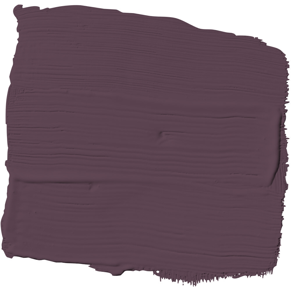
This time last year, Purple Basil had a small part in one of the four color palettes featured in PPG and Glidden’s 2024 Global Color & Design Trends report. Now, this alluring purple is ready not only to take center stage, but command the spotlight wherever it goes.
Trend forecasters at the paint and coatings sister brands saw the seeds of the earthy aubergine’s impending bloom everywhere from Fashion Week runways to automotive shows. (AD PRO even hyped purple-red hues as a color of the moment earlier this year.) But the real story behind Purple Basil’s climb up the 2025 Color of the Year podium ultimately comes down to the average consumer’s increasing confidence when it comes to using color. By leaning into the expressive possibilities offered up by its exquisitely precise balance of red and blue tones, says Ashley McCollum, a PPG color expert for the Glidden brand, Purple Basil allows anyone to write their own unique color story.
“This is a deep, bold, dramatic purple that really speaks to that continuation of consumers unapologetically selecting colors that bring them joy, and they’re worrying less and less about resale value,” McCollum tells AD PRO. “This is a color that really empowers you to have that freedom.”
And that includes the liberty to interpret this chameleonic color as one sees fit. Moody yet insistent, Purple Basil can conjure disparate moods depending on the lighting of a room or even the sheen of a particular bookcase or molding. This energetic purple also exists primarily in the context of its surrounding design choices, but that hardly limits the breadth of its aesthetic potential. To McCollum, Purple Basil has the range to accentuate the humble touches of Arts and Crafts handiwork while suiting Postmodernism’s desire for confrontation.
“It almost has this regal feel to it, but it’s just as equally homey and warm,” McCollum says of Purple Basil’s aesthetic shiftiness. “It has that slight red undertone to give it that warmth, but it still feels fresh and very modern.”
Take interior walls, for example. If you’re drawn to vintage wallpaper, painting the surrounding trim or wainscotting Purple Basil amps up the opulence, turning any room into a jewelry box—especially if gold accents are involved. For those in search of a more of a sensory experience, it curates a soft, smooth vibe when used to color drench rooms decked out in plush textures and warm woods. Anywhere there’s cabinetry, Purple Basil has the power to add depth and drama in more ways than one. In situations where it skews a little red, the Color of the Year also provides opportunities to integrate the soft, vintage colors that have come back into vogue.

